最近看到一个网站使用的圆角效果挺不错的,忙里偷闲今天也研究了一下。下面分享几个使用css3实现的圆角实例。
使用css3实现圆角效果主要是用到了 border-radius 这个属性,这个是css 3.0中新增的一个属性。这里将 border-radius 的兼容性列举如下;
| 浏览器 | 支持性 |
|---|---|
| Firefox(2、3+) | √ |
| Google Chrome(1.0.154+…) | √ |
| Google Chrome(2.0.156+…) | √ |
| Safari(3.2.1+ windows) | √ |
| Internet Explorer(IE7, IE8) | × |
| Opera 9.6 | × |
border-radius 属性的值即圆半径的值。
因为浏览器引擎的原因,针对 firefox Safari和Chrome 这两种浏览器则有其特殊的写法,即 -moz-border-radius 和 -webkit-border-radius
-moz-border-radius 用于 Firefox
-webkit-border-radius 用于 Safari和Chrome
注意这三种形式的书写需要遵循一定的顺序的,顺序如下:
#radius {
    -moz-border-radius: 15px;      /* Gecko browsers */
    -webkit-border-radius: 15px;   /* Webkit browsers */
    border-radius:15px;            /* W3C syntax */
}
border-radius 也可以像 border 属性那样分开写,即:
border-top-right-radius
border-bottom-right-radius
border-bottom-left-radius
border-top-left-radius
那么针对firefox Safari和Chrome 则加上相应的前缀(-moz- -webkit-)就是了。
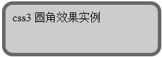
下面演示一个简单的通过 css3 实现的圆角效果,首先贴下效果图:
下面是示例代码:
<!DOCTYPE html PUBLIC "-//W3C//DTD XHTML 1.0 Transitional//EN" "http://www.w3.org/TR/xhtml1/DTD/xhtml1-transitional.dtd">
<html xmlns="http://www.maopiaopiao.com/javascript-function/833.html">
<head>
<meta http-equiv="Content-Type" content="text/html; charset=utf-8" />
<title>css3 圆角效果实例</title>
<style type="text/css">
#round {
    padding:10px; width:200px; height:50px;
    border: 5px solid #666;
    background-color:#CCC;
    -moz-border-radius: 15px;      /* Gecko browsers */
    -webkit-border-radius: 15px;   /* Webkit browsers */
    border-radius:15px;            /* W3C syntax */
}
</style>
</head>
<body>
<div id="round">css3 圆角效果实例</div>
</body>
</html>
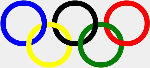
有牛人用这个实现了一个奥运五环的标志,喜欢的可以看看(注意请在支持 border-radius 属性的浏览器上面看效果):
css3圆角实现奥运五环标志(效果图如下)